Cisco Webex - Control Hub Lite
Redesign Cisco Webex Control Hub’s portal into a streamlined and engaging experience on Control Hub Lite
UX Designer
Figma
Desktop Web

Overview
Problem
Control Hub Lite is a redesign of Webex’s existing Control Hub admin web management portal which, as new features were added, became cumbersome to use over time. In addition to selling software subscription plans, Webex also sells videoconferencing hardware devices and has a business goal of increasing hardware sales overall. This project aims to reevaluate content strategy for Control Hub Lite to streamline core admin features, and increase visibility and sales of Webex hardware devices.
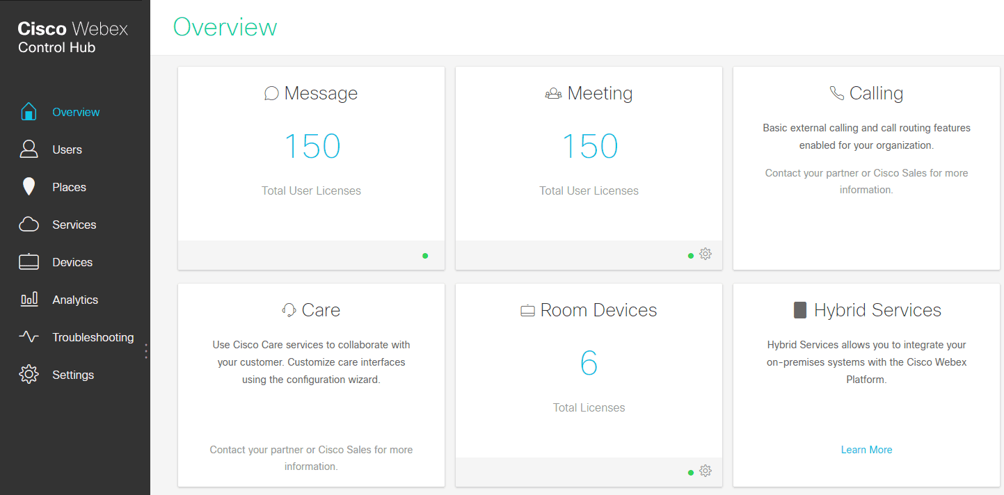
Original Cisco Webex Control Hub web management portal
Problem
Control Hub Lite is a redesign of Webex’s existing Control Hub admin web management portal which, as new features were added, became cumbersome to use over time. In addition to selling software subscription plans, Webex also sells videoconferencing hardware devices and has a business goal of increasing hardware sales overall. This project aims to reevaluate content strategy for Control Hub Lite to streamline core admin features, and increase visibility and sales of Webex hardware devices.
Original Cisco Webex Control Hub web management portal
Objective
Leveraging existing user feedback, the design of Control Hub Lite must be a lightweight, functional, and engaging home page.
The new design must:
Address existing pain points about the plan, billing, and user management experiences from Control Hub
Streamline the user experience by focusing on core features
Encourage users to buy new hardware and upgrade their subscription plan
Goals
Approach
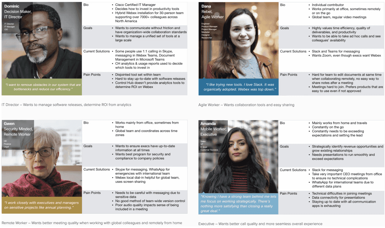
Personas
Drawing from existing user research from the Webex UX research team, I distilled the information into personas to more accurately capture context for the initial scope I was designing for.
Some of the following assumptions were made in developing these personas:
All users used in our research are pre-existing customers that are already familiar with Webex video calling
“Remote Worker” is defined as any worker that does not work from a given office (works from home, on the go, global workers, etc.). From a hardware perspective, these users have similar needs and thus have similar considerations moving forward
Opportunities
From the data, I took users’ pain points and reframed them as design opportunities through the lens of encouraging users to buy hardware and upgrade their software.
Provide visual guides and solutions for large-scale, unified video conferencing setups
Analytics tools to determine ROI, licensing, etc. in Control Hub to help advise tool investments
Emphasize overall service stability, reliability, and security when recommending and marketing hardware solutions
Highlight ease of network setup and maintenance
Show productivity advantages for co-located teams because of better video and collaboration tools
Examples: Shared notes, whiteboarding, better call quality, integration with Webex Teams, etc.
Inspiration
With these goals and insights in mind, I looked at other sites and products to help brainstorm more ideas.
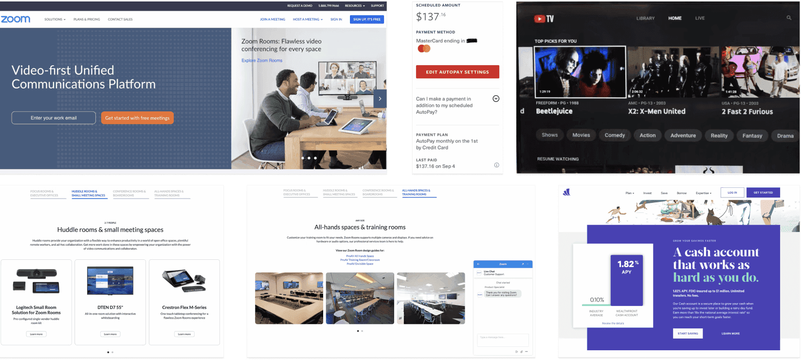
From left to right, top to bottom:
Zoom (Home) – Carousel to highlight different target user needs in one page
Traveler’s Insurance (Billing) – Prominently surfaces core features and billing information, such as scheduled payment amount, payment method, and date of next charge
YouTube TV (Home) – Overarching qualitative approach: show existing subscription value instead of overwhelming the user with feature upgrades, by providing tailored recommendations based on what would create best value for the user
Zoom (Hardware Recommendations) – Tailored hardware recommendations according to room size
Zoom (Gallery & Chat Support) – Image-centric presentation, detailed technical design guides for setting up infrastructure, prominent live chat support
Wealthfront (Home) – Tagline uses personable, engaging UX copy that draws the user in. Visual design aspects such as contrasting colors, blocking and layout, and bold leading lines communicate energy and dynamism. Serif instead of sans serif typographic choices convey trustworthiness and reliability
Inspiration
With these goals and insights in mind, I looked at other sites and products to help brainstorm more ideas.
From left to right, top to bottom:
Zoom (Home) – Carousel to highlight different target user needs in one page
Traveler’s Insurance (Billing) – Prominently surfaces core features and billing information, such as scheduled payment amount, payment method, and date of next charge
YouTube TV (Home) – Overarching qualitative approach: show existing subscription value instead of overwhelming the user with feature upgrades, by providing tailored recommendations based on what would create best value for the user
Zoom (Hardware Recommendations) – Tailored hardware recommendations according to room size
Zoom (Gallery & Chat Support) – Image-centric presentation, detailed technical design guides for setting up infrastructure, prominent live chat support
Wealthfront (Home) – Tagline uses personable, engaging UX copy that draws the user in. Visual design aspects such as contrasting colors, blocking and layout, and bold leading lines communicate energy and dynamism. Serif instead of sans serif typographic choices convey trustworthiness and reliability
Sketches
Given the constraints, I decided that designing a homepage carousel would be a good option to explore, since it gives an opportunity to address one to two specific persona needs per panel. The bottom half of the homepage would be focused on billing and would stay static.
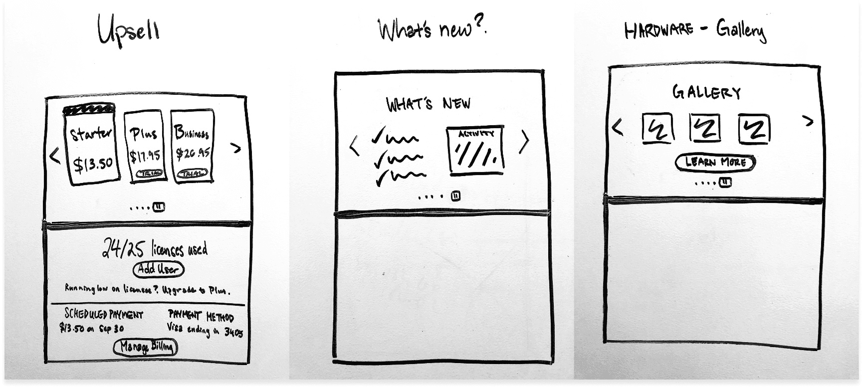
Upsell
(Top half) Free trial for subscription to invite people to experience true value of subscription upgrade
(Bottom half) Emphasize the value of what users are already subscribed to. Only suggest upgrade if nearing license limit. Repeats for all screens
What's New?
(Left) List of new features
(Right) Account activity
Hardware - Gallery
Image-centric display of hardware products to encourage upsell

Hardware - Current Config
(Left) Existing pool of devices
(Right) Ability to scan barcode to add a new hardware device to pool, tailored recommendations based on existing hardware, live support
Analytics
Statistic to highlight subscription ROI
Upgrades - Software
Easy way to update software and see new features, to address secondary goal
Sketches
Given the constraints, I decided that designing a homepage carousel would be a good option to explore, since it gives an opportunity to address one to two specific persona needs per panel. The bottom half of the homepage would be focused on billing and would stay static.
Upsell
(Top half) Free trial for subscription to invite people to experience true value of subscription upgrade
(Bottom half) Emphasize the value of what users are already subscribed to. Only suggest upgrade if nearing license limit. Repeats for all screens
What's New?
(Left) List of new features
(Right) Account activity
Hardware - Gallery
Image-centric display of hardware products to encourage upsell
Hardware - Current Config
(Left) Existing pool of devices
(Right) Ability to scan barcode to add a new hardware device to pool, tailored recommendations based on existing hardware, live support
Analytics
Statistic to highlight subscription ROI
Upgrades - Software
Easy way to update software and see new features, to address secondary goal
Wireframes
Using feedback from the sketches, I created wireframes to further actualize the design. Most notably, each carousel frame was distilled to have only one major CTA, and concerns were separated between addressing hardware and software goals.
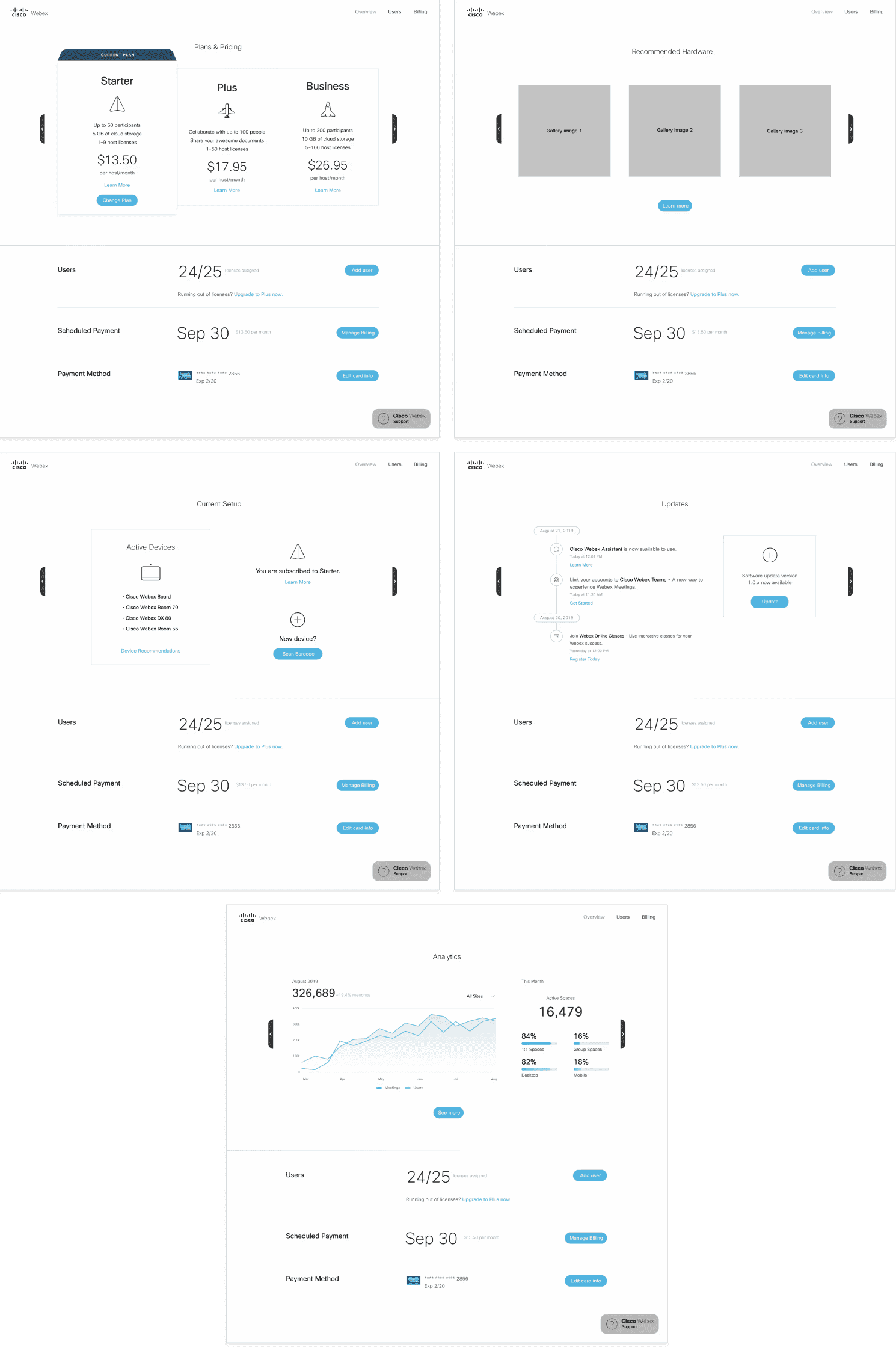
Plans & Pricing
(Top half) Concrete numbers to support package details to show value of subscription tier. Prominent primary CTA to serve secondary goal
(Bottom half) Clear CTAs for core home page features users need to manage their account
Recommended Hardware
Gallery images with singular CTA
Current Setup
Pool of active devices on the left with device recommendations. Icons and images to make the page more visually engaging
Updates
Timeline of newly released features with links to associated descriptions. Prominent CTA to update software to streamline software management
Analytics
Main graph with KPI and key metrics to help determine ROI
Wireframes
Using feedback from the sketches, I created wireframes to further actualize the design. Most notably, each carousel frame was distilled to have only one major CTA, and concerns were separated between addressing hardware and software goals.
Plans & Pricing
(Top half) Concrete numbers to support package details to show value of subscription tier. Prominent primary CTA to serve secondary goal
(Bottom half) Clear CTAs for core home page features users need to manage their account
Recommended Hardware
Gallery images with singular CTA
Current Setup
Pool of active devices on the left with device recommendations. Icons and images to make the page more visually engaging
Updates
Timeline of newly released features with links to associated descriptions. Prominent CTA to update software to streamline software management
Analytics
Main graph with KPI and key metrics to help determine ROI
Solution
Hi-Fidelity Mockups
The next step was to generate mockups based on feedback from the wireframes. The main pieces of feedback were that:
Graphs and copy language are too technical, especially for three of the four personas being targeted. Take care to make sure all personas’ needs are being addressed.
Overall, copy messaging needs to be more energetic, engaging, and have a more colloquial tone.
For Webex hardware, emphasize quality of experience for remote collaboration and life-like video conferencing.

Hardware Collaboration
Visually emphasize collaboration in different contexts, aimed towards IT directors and business executives
Whiteboarding
Whiteboarding features directly address agile worker’s pain point about real-time collaboration and easily sharing notes after a meeting
Personal Video Conferencing
Targeted towards global and remote workers to help visualize how their remote video conferencing experience can be improved using a hardware device instead of simply using a laptop or mobile device
Webex Teams Wireless Sharing
Highlights existing integration between Webex Teams and Webex hardware, to encourage users such as the agile and remote workers to unify their tool set to Webex products
Updates
Intentional typographic choices to emphasize new features, and a bolder image-centric visual approach to address IT directors
Plans & Pricing
Summary taglines are changed to be less technical and even more accessible for business execs to quickly determine value for their team at each service tier
Testimonials
The first two testimonials are targeted towards remote workers and business execs, emphasizing overall improvement in their user experience after upgrading hardware. The third testimonial showcases Webex’s ability to go beyond the basics and cater to an emotionally delightful video experience
One of the main points of feedback was that a few of the panels were too technical; as a result, I decided not to include some mockup panels in the final design, since they did not directly serve the ultimate goal for the majority of our target audience.

Current Setup
This panel was ruled out because it is not relevant information for a homepage since it is too niche, technical, and detailed, even for IT directors

Analytics
Though this addresses a direct pain point from the personas, it is difficult to determine a specific metric to portray ROI because determining the “best” criteria varies by case. In one case, a particular set of metrics could convey a “good” ROI, but in another case it could convey the opposite. Ultimately, it is best left out of the final design
Hi-Fidelity Mockups
The next step was to generate mockups based on feedback from the wireframes. The main pieces of feedback were that:
Graphs and copy language are too technical, especially for three of the four personas being targeted. Take care to make sure all personas’ needs are being addressed.
Overall, copy messaging needs to be more energetic, engaging, and have a more colloquial tone.
For Webex hardware, emphasize quality of experience for remote collaboration and life-like video conferencing.
Hardware Collaboration
Visually emphasize collaboration in different contexts, aimed towards IT directors and business executives
Whiteboarding
Whiteboarding features directly address agile worker’s pain point about real-time collaboration and easily sharing notes after a meeting
Personal Video Conferencing
Targeted towards global and remote workers to help visualize how their remote video conferencing experience can be improved using a hardware device instead of simply using a laptop or mobile device
Webex Teams Wireless Sharing
Highlights existing integration between Webex Teams and Webex hardware, to encourage users such as the agile and remote workers to unify their tool set to Webex products
Updates
Intentional typographic choices to emphasize new features, and a bolder image-centric visual approach to address IT directors
Plans & Pricing
Summary taglines are changed to be less technical and even more accessible for business execs to quickly determine value for their team at each service tier
Testimonials
The first two testimonials are targeted towards remote workers and business execs, emphasizing overall improvement in their user experience after upgrading hardware. The third testimonial showcases Webex’s ability to go beyond the basics and cater to an emotionally delightful video experience
One of the main points of feedback was that a few of the panels were too technical; as a result, I decided not to include some mockup panels in the final design, since they did not directly serve the ultimate goal for the majority of our target audience.
Current Setup
This panel was ruled out because it is not relevant information for a homepage since it is too niche, technical, and detailed, even for IT directors
Analytics
Though this addresses a direct pain point from the personas, it is difficult to determine a specific metric to portray ROI because determining the “best” criteria varies by case. In one case, a particular set of metrics could convey a “good” ROI, but in another case it could convey the opposite. Ultimately, it is best left out of the final design
Results
After working with the UX research team to develop methods for user testing, this flow was released under customer beta testing for Webex Control Hub Lite. The designs were improved and refined based on feedback, and a first iteration focused on simplifying and modernizing the plan, billing, and user management experiences was released live to users.
After working with the UX research team to develop methods for user testing, this flow was released under customer beta testing for Webex Control Hub Lite. The designs were improved and refined based on feedback, and a first iteration focused on simplifying and modernizing the plan, billing, and user management experiences was released live to users.
Lessons Learned
Reframe Relentlessly
At each step, relentlessly reframe perspective to keep the focus on the main goal, real user pain points, and feedback. There were moments during this project where ideas sounded plausible but eventually did not serve to be purposeful in achieving the main goals, and eventually needed to be eliminated in order to create the most compelling and effective design possible.
Visual design is its own language
Sometimes it can be easy to think that visual design doesn’t matter and get lost in seemingly minute details such as choosing between nuanced shades of colors, layouts, and typefaces. Visual design thinking is imperative; it’s a tool set that needs to be approached with thoughtfulness and respect, in order to most effectively communicate visually through characteristics like dynamism and hierarchy.
Content strategy is only part of the puzzle
This project’s focus was on content strategy. To expand this project, the next step could be to explore more visual design possibilities, branching out from the constraints of a carousel. For instance, instead of accentuating brand loyalty, there could be ways to better allocate screen real estate to emphasize hero content because we are specifically targeting users that are existing customers.